The Indian automobile market is home to numerous major automakers, each with a unique logo that reflects the identity and history of the brand. Let’s delve into the logos of popular car manufacturers in India, exploring their meanings and evolution.
1. Maruti Suzuki Limited
- Years: 1981 – Present
- Parent Company: Suzuki
- Headquarters: New Delhi, India
- Website: Maruti Suzuki
Logo Evolution: Maruti Suzuki India Limited, a subsidiary of Suzuki Motor Corporation, has dominated the Indian market since its establishment in 1981. The brand’s logo has evolved over the years, transitioning from having the names of the two companies stacked to being positioned side by side. The font has remained consistent, but the color has become lighter, symbolizing vitality. The tagline “Count on us” was replaced with “Way Of Life,” reflecting the brand’s commitment to customer satisfaction.
2. Hyundai Motor India Limited
- Years: 1996 – Present
- Parent Company: Hyundai Kia Automotive Group
- Headquarters: Chennai, Tamil Nadu, India
- Website: Hyundai
Logo Insight: Hyundai, the largest automaker in South Korea and the seventh-largest globally, features an italic ‘H’ embedded in an oval as its logo. The design represents two human figures—customer and company—shaking hands, symbolizing mutual respect and trust. The logo exudes a smooth and fluid impression, creating an attractive and friendly brand image. The blue color signifies excellence, reliability, and supremacy, while silver represents creativity, perfection, and sophistication.
3. Mahindra & Mahindra (M&M)
- Years: 1945 – Present
- Parent Company: Mahindra Group
- Headquarters: Mumbai, Maharashtra, India
- Website: Mahindra
Logo Philosophy: Mahindra & Mahindra Limited, India’s largest tractor manufacturer and a significant auto brand, boasts a logo with a simple yet profound design. The ‘M’ in the logo represents three equal divisions pointing upwards, resembling an ape on its tip. These divisions symbolize products, services, and possibilities, aligning with the company’s core tenets of driving positive change, thinking alternatively, and accepting no limits. In the Hindu language, Mahindra means God, King, or great Indra of the Earth.
4. Toyota Kirloskar Motor
- Years: 1997 – Present
- Parent Company: Toyota Motor Corporation
- Headquarters: Bidadi, Bangalore, Karnataka
- Website: Toyota
Logo Symbolism: As a subsidiary of Toyota Motor Corporation, Toyota Kirloskar Motor is the fourth-largest automaker in India. The Toyota logo features three ovals horizontally arranged, with two smaller ovals inside the larger one. This design represents the customer’s heart, the company’s heart, and a win-win relationship between them. The ovals also form the letter ‘T,’ signifying the Japanese automaker. Varied stroke thickness in the ovals reflects Japanese brush art, while the space inside the logo embodies values such as social responsibility, environmental consciousness, safety, innovation, driving joy, exceeding expectations, and superb quality.
5. Tata Motors Limited
- Years: 1945 – Present
- Founder/Parent Company: Tata Group
- Headquarters: Mumbai, Maharashtra, India
- Website: Tata Motors
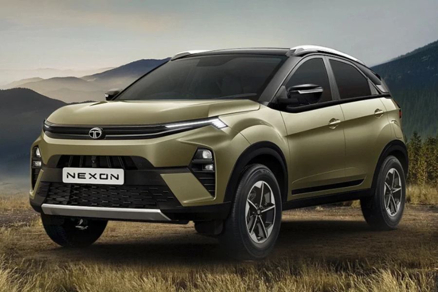
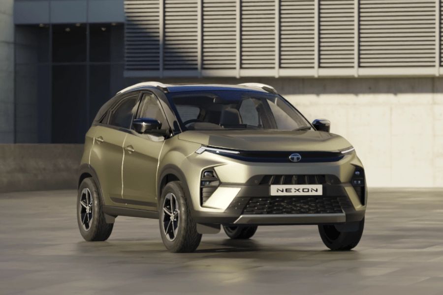
Logo Simplicity: Tata Motors Limited, headquartered in Mumbai, is an Indian multinational automotive corporation. The company’s logo is a straightforward representation of a capital letter ‘T,’ with the company name “Tata” at the bottom. The blue color scheme signifies adaptability and fluidity, while the logo is said to depict a tree of trust providing shelter. Blue represents strength, reliability, and excellence.
6. Honda Cars India
- Years: 1995 – Present
- Founder/Parent Company: Honda Motor Co. Ltd
- Headquarters: Greater Noida, Uttar Pradesh
- Website: Honda Car India
Logo Representation: Honda, a prominent car company in India, features a simple logo with the capital letter ‘H’ in a clean design. The thick and wide letter reflects reliability, durability, and trustworthiness. The ‘H’ is narrower at the top and broader at the bottom, resembling arms rising toward the sky, aligning with the company’s motto: “The Power of Dreams.” The logo incorporates black, red, and silver colors, symbolizing sophistication, passion, and elegance.
Conclusion: These car logos in India encapsulate the essence of their respective brands, representing not only the evolution of the companies but also their values and commitments. Each logo tells a unique story, contributing to the rich tapestry of the Indian automotive landscape.
Read More:


