


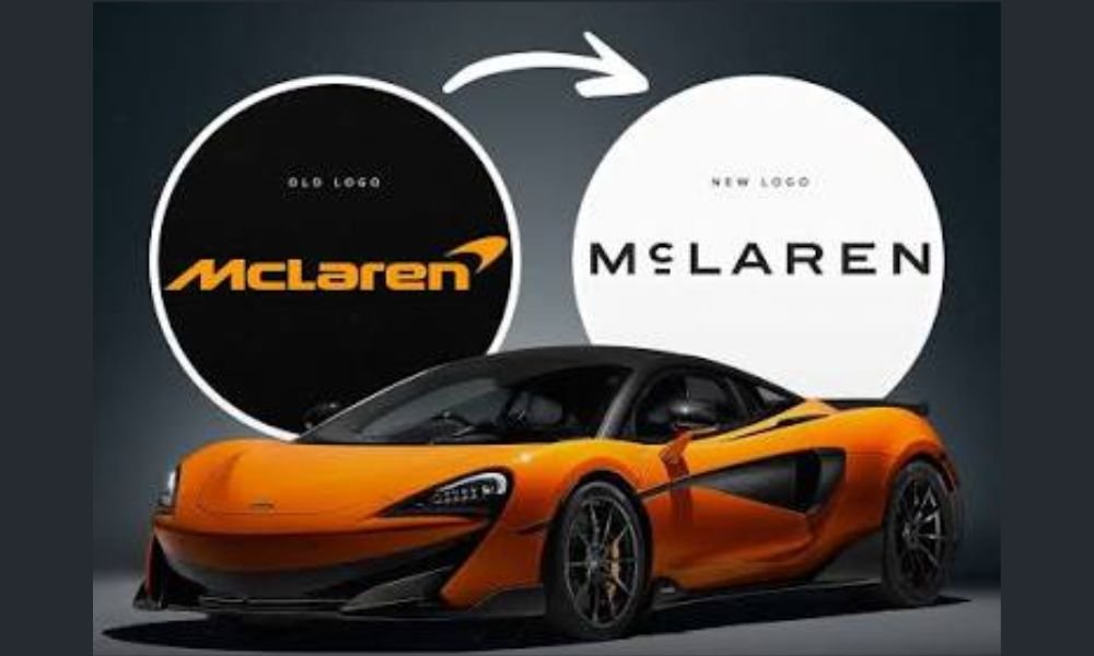
McLaren has unveiled a new logo and visual identity, marking a significant change to the way the British performance carmaker presents itself across its road cars, racing programmes, merchandise and digital platforms. Revealed on September 22, 2026, the new McLaren wordmark takes inspiration from a much older piece of the company’s history, the sign that once stood above the McLaren family’s service station in Remuera, Auckland, New Zealand.
Unlike a complete departure from its existing identity, McLaren describes the change as an evolved brand identity. The familiar Speedmark remains part of the branding, while the new wordmark gives the company a cleaner and more understated appearance. The change comes as McLaren prepares for a broader expansion of its automotive business, including new models and its first SUV.
Key Highlights
- McLaren has introduced a new wordmark as part of an evolved brand identity.
- The design is inspired by the sign above Bruce McLaren’s parents’ service station in Auckland.
- The new identity will be used by both McLaren Automotive and McLaren Racing.
- A bespoke typeface called McLaren Sans has been created for the new branding.
- The familiar McLaren Speedmark will continue to be used as part of the identity.
- The McL 6GT is the first vehicle to feature the new branding.
What Does McLaren’s New Logo Look Like?
The biggest change is the McLaren wordmark itself. The new lettering uses a wider, cleaner sans-serif design and is noticeably less heavy than the familiar McLaren lettering used in recent decades.
One of its most distinctive details is the lowercase “c”, which sits on a subtle horizontal line. This element is directly inspired by the lettering used on the old McLaren family service station in Remuera.
McLaren has also developed a bespoke typeface called McLaren Sans, which forms part of the wider visual identity. The new wordmark is intended to work consistently across cars, racing equipment, merchandise, showrooms and digital platforms.
The change is therefore more than a simple logo redesign. McLaren is using the new identity to create a common visual language for its automotive and racing operations.
The Story Behind the New McLaren Logo
The connection between the new logo and Bruce McLaren is central to the redesign.
Bruce McLaren’s parents, Les and Ruth McLaren, operated a service station in Remuera, Auckland. The workshop became an important part of Bruce’s early mechanical development. It was also where he worked on an Austin Seven that eventually helped him achieve his first motorsport victory at Muriwai Beach.
McLaren has taken the lettering from the historic service station sign and reworked it for modern use. That gives the new identity a direct connection with the company’s founder rather than creating an entirely new visual symbol.
This is particularly relevant because McLaren is entering another major phase of expansion. The company is moving beyond its traditional focus on two-seat supercars, with new products and manufacturing investment planned for the coming years.
What Happens to the McLaren Speedmark?
The familiar Speedmark is not being discontinued.
McLaren says the Speedmark remains an important part of the brand and will continue to appear as an identifying element. The difference is that the new wordmark will take a more prominent role in the overall identity.
This means McLaren enthusiasts are unlikely to see the instantly recognisable Speedmark disappear altogether. Instead, the company is combining the historic-inspired lettering with the existing symbol.
The approach also gives McLaren greater flexibility. The wordmark can be used prominently on vehicles and products, while the Speedmark can continue to function as a compact brand identifier.
McLaren’s New Colour Direction
The rebranding also brings changes to McLaren’s broader colour strategy.
Papaya remains one of the most important colours associated with McLaren, particularly in motorsport. However, the company is expanding its palette with colours inspired by different periods of its history. A darker Midnight shade is expected to become more closely associated with McLaren’s road-car identity, while Papaya continues to have a strong connection with racing.
The change gives the road-car business a more restrained visual character without removing the colour that has become synonymous with McLaren’s racing heritage.
Which McLaren Gets the New Logo First?
The new identity has already appeared on the McL 6GT, McLaren’s recently revealed concept that combines modern performance technology with design references to the company’s heritage.
The McL 6GT was unveiled at Monterey Car Week in August 2026 and is the first McLaren vehicle to display the new branding. Future production models are expected to use the new wordmark, including on the rear of the vehicles.
The timing is significant because McLaren is preparing a wider expansion of its product portfolio. The company has confirmed plans for its first SUV and is investing heavily in additional UK manufacturing and engineering capacity.
New Logo Comes as McLaren Enters a New Era
McLaren’s logo change arrives at a time when the company is making some of its biggest strategic moves in years.
The company recently announced plans for a new UK vehicle assembly facility and further investment in its manufacturing and engineering operations. McLaren is also preparing to broaden its range beyond the traditional two-seat sports-car formula, with future front-engined models and an SUV planned.
Against that backdrop, the new identity is designed to represent both continuity and change. The connection to Bruce McLaren gives the brand a historical foundation, while the cleaner design is intended to support the company as it expands into new areas.
Old vs New McLaren Branding
| Aspect | Previous Identity | New Identity |
|---|---|---|
| Main wordmark | Bold McLaren lettering | New McLaren wordmark inspired by historic signage |
| Speedmark | Major brand element | Retained as an identifier |
| Typeface | Previous McLaren lettering | Bespoke McLaren Sans |
| Heritage reference | Motorsport-focused evolution | Direct link to Bruce McLaren’s family service station |
| Road-car direction | Papaya strongly associated with brand | Greater use of darker Midnight tones |
| Application | Automotive and racing identities | Unified Automotive and Racing identity |
What the New Logo Means for Future McLaren Cars
For buyers, the new logo does not change the mechanical specification, performance or equipment of an existing McLaren model. It is primarily a visual and corporate identity change.
However, future McLaren models will increasingly carry the new branding as the company introduces products designed for a wider audience. The move is particularly interesting because the brand is preparing to enter segments that sit outside its traditional supercar portfolio.
For enthusiasts, the most important detail is that McLaren has not abandoned its visual heritage. The Speedmark remains, Papaya continues to have an important role, and the new wordmark itself comes from one of the earliest chapters of Bruce McLaren’s story.
FAQs
Why has McLaren changed its logo?
McLaren has introduced an evolved brand identity to create a more unified visual identity across McLaren Automotive and McLaren Racing while reconnecting the brand with its founder, Bruce McLaren.
What inspired the new McLaren logo?
The new wordmark is inspired by the historic sign above the McLaren family’s service station in Remuera, Auckland, New Zealand.
Is McLaren discontinuing the Speedmark?
No. The Speedmark will continue to be used as part of McLaren’s visual identity, while the new wordmark becomes a more prominent element.
Which McLaren car gets the new logo first?
The McL 6GT is the first vehicle to feature the new McLaren branding.
What is McLaren Sans?
McLaren Sans is the bespoke typeface developed as part of the company’s new visual identity. It is intended for use across McLaren’s automotive, racing, merchandise and digital applications.
Will the new logo be used on future McLaren cars?
Yes. McLaren says the new identity will gradually be introduced across future production vehicles, as well as other brand touchpoints.
Conclusion
McLaren’s new logo is a relatively subtle redesign, but its significance comes from where the design originated. Rather than creating a completely new symbol, McLaren has returned to the lettering associated with Bruce McLaren’s family service station in Auckland and adapted it for a modern global brand.
The new wordmark, McLaren Sans, continued use of the Speedmark and revised colour direction will become increasingly visible as the company expands its product range. With the McL 6GT already carrying the new identity and an SUV and other new models in development, the redesigned branding marks the visual beginning of a broader chapter for McLaren.
Read More: